
Motherhood project progress 1/2
This blog post will be a living document, I’ll add to it several times over the next couple of weeks. In addition I will make daily journal entries (began Mon 9th May).
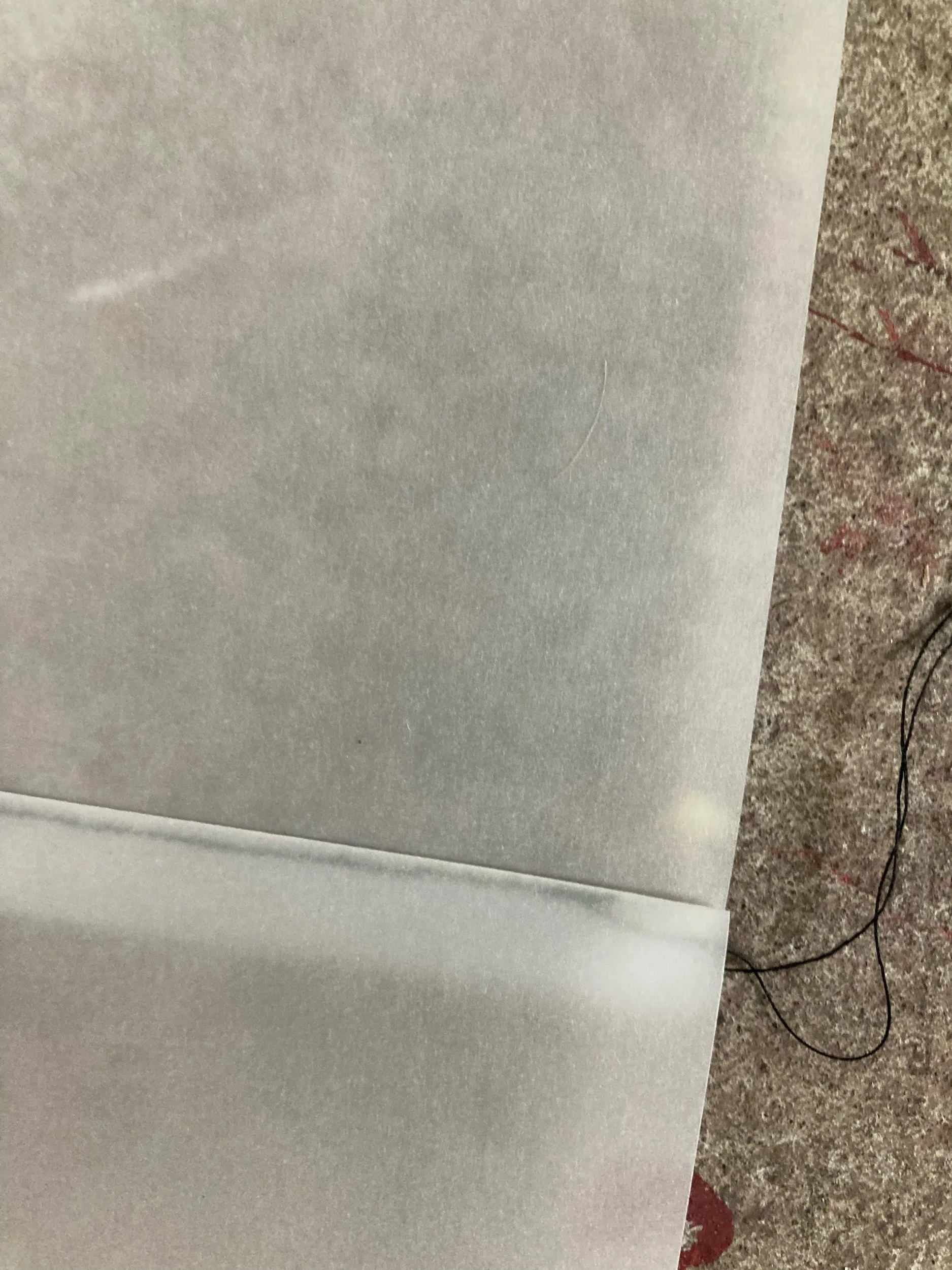
Wed 11th May - I’ve started some sketches on tracing paper (Reeves 110gsm acid-free A3) experimenting with the mediums of oil pastel and acrylic paint. I’ve been enjoying the paper as a surface as pastel can be easily wiped or scratched off. However the oil pastel is more suited to older subjects, the mark making giving the illusion of wrinkles and lines. I will try my next sketches with a softer conte or similar.


Babies faces are always difficult to get the proportions right, but also the perspective of having Billie looking up into the phone camera is quite tricky so to trace the image in future works to ensure this is correct.
Being transparent paper the light also impacts more highly on the work so making sure to explore how it looks in different light / back lit - see video below. Last clip shows how images could layer.
Research led me to a podcast featuring the author of a book titled ‘The Baby on the Fire Escape: Creativity, Motherhood, and the Mind-Baby Problem’ by Julie Phillips. I will make the effort to read the book, but got a lot from the podcast. She spoke of motherhood as being “a series of moments when you give away too many pieces of yourself and you have to recollect yourself” - when journalling this sparked the concept of the larger artwork being not a series of works but one larger artwork made up of ‘pieces’ (A3 paper). This also sparks ideas of collage / photomontage.


Julie Phillips also recommends the book ‘Motherhood’ by Shelia Heti (confronts the philosophical questions raised by childbearing and womanhood). I also came across the Australian books ‘The Motherhood’ by Jamilia Rizvi (an anthology of letters about life with a newborn) and ‘Motherhood and Creativity: the divided heart’ edited by Rachel Power (interviews with writers, actors, musicians, and artists). I will get these titles on Audible if I am able to, and purchase if they are particularly pertinent to my project/interest in portraying motherhood.
I’ve also been inspired by riso zines on Pinterest like the ones below. I have committed to create a catalogue as part of my final works - I think I will make it more of a zine type approach with photographic / photomontage works on one side of a folded A3, and the catalogue (exhibited works and artist statement) on the other side.


I came across some film cameras while packing our house that still have film in them, along with some unused film so thinking to use these for my project. I will need to do the photoshoot/s this week to allow time for processing. To be mindful of creating images that are references for drawings, and then other images that will be used in the catalogue.
Saturday 14th May - completed the below soft black pastel sketch of Billie looking into the camera. Not sure it translates in a way that communicates the ‘baby-in-my-face-no-personal-space-fingers-in-my-mouth-nose-eyes’ type of physicality but could potentially work in concert with another image. It could also translate better with a shape of a hand in foreground as opposed to just shapeless shadow.
Eleven (5yo) and wanted to help so she made some of the marks on the right hand side of image in shadow area. I think I like the irregularity of her mark-making far more than my own more regular shading.
Soft black pastel on 70gsm tracing paper - marks on right side by my 5yo daughter
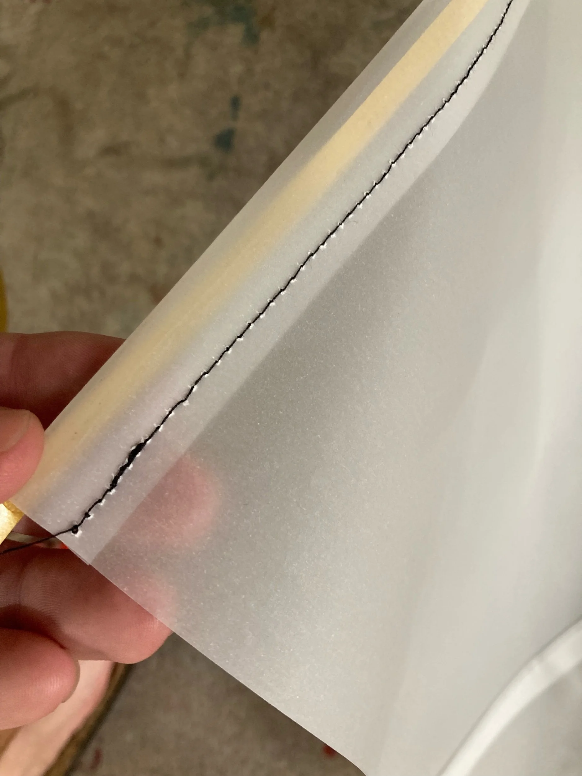
Tuesday 17th May - experimented with sewing tracing paper sheets together. I used black cotton. The idea is to play on the “pieces of me” (to find quote) and I also like the shared stories of wanting to make my daughter clothes (but not) - not measuring up to my own ideals as a mother.


I think the regular zigzag stitch is best for this but it may interrupt the composition too much unless I switch to a lighter shade of cotton. The top edge is folded and sewn to allow for hanging from thin dowel or cord.
I also sprayed the sketch of Billie’s face with some fixative - I don’t think it has altered the pastel appearance at all and it definitely has protected it from smudging. This gives me confidence to move forward with this medium.
Wed 18th May - sewed 4 sheets of A3 together using the method below. Was a simple no fuss method that I think won’t detract from the artwork. I am planning to purchase 20 sheets of A2 on Friday to make 3-4 banners. Sketched outline onto banner using laptop as light box and painted in blacks. Excited to get sketching and see how the final product could come together.
Also took videos on my iPhone, some Billie held the phone, others I held it, others it was resting on top of a box looking through the viewfinder of my Yashica twin lens camera.


One video in which I held the phone and shot her breastfeeding is too in-your-face-boobs 😅🤣 I like the slight removal that the video shot through viewfinder offers though I’m not sure if it really speaks to the viewer of intimacy and physciality. It does offer another dimension of me by pointing to my interest in vintage cameras. To continue to explore how I can capture this.
Thursday 19th May - Draft artist statement / written synthesis:
Monotone pastel sketches of myself and my baby daughter on translucent sheets that hang in space, surrounded with multiple projections, creating layered visuals that shift and change as the viewer moves around the space, their body becoming a part of the work as the projections move across them, and the banners sway in the breeze created by their movement. A folded catalogue of works printed in risograph colours unfolds to reveal a photographic essay on the rear, a small treasure to possess.
I have always been drawn to create works that speak of the internal landscape of emotional, mental and spiritual layers. Monotone palettes, particularly greys and blacks have always spoken to me and I’ve used them a lot in my work. Initially as black and white photographic ‘landscapes, more recently in painted portraits. There is an element of bleakness/serenity (duality) which I identify with on an emotional level. I am also enjoying the simplicity it brings, the focus on tone and form.
Motherhood has been a transformative event that has created demands on all parts of myself and I’m continually bemused and amused by the dualities that exist within relationships, within moments, within myself. I’ve found there is a physicality in this first year of mothering a child that is without comparison to anything else I’ve experienced. I hope to convey something of this experience of intimacy, lack of personal boundaries, endurance, and altered sense of self in all forms. This work is an exploration of what it means to be a mother, but of course more deeply on who I am as a mother, as Mum to these beautiful creatures now 11 months old, and 5 years old.
Banner sketch progress:
I had painted in some shadow areas yesterday and today I began with the black pastel. The seam is quite distinct now there is pastel over the top, still considering if this detracts too much.


Considering if the seam creates too much of a distraction / interruption
Friday 20th May - worked on banner sketch
I became frustrated with the black pastel and maintaining contrast and tried using darker and more expressive line but I wasn’t happy with the result so…
I took a wet cloth to it to remove layers of pastel. I really like this stripped back quality - something I realised while journaling last night. The issue now is how to bring back some details like eyes. I might try graphite or compressed charcoal??
Started to explore folds for the catalogue. It will be printed on A3 but potentially folded much smaller. My current preference is the ‘8 page zine fold’ which does have a cut through the middle but I could play with that on poster side.


Thursday 26th May - As part of the process of formulating an artist’s statement I have begun to revisit my past work and see the links and development of themes, not only that but identifying how I like to work and what methodology is key to my artistic process. Below are some examples of past motherhood themed works:

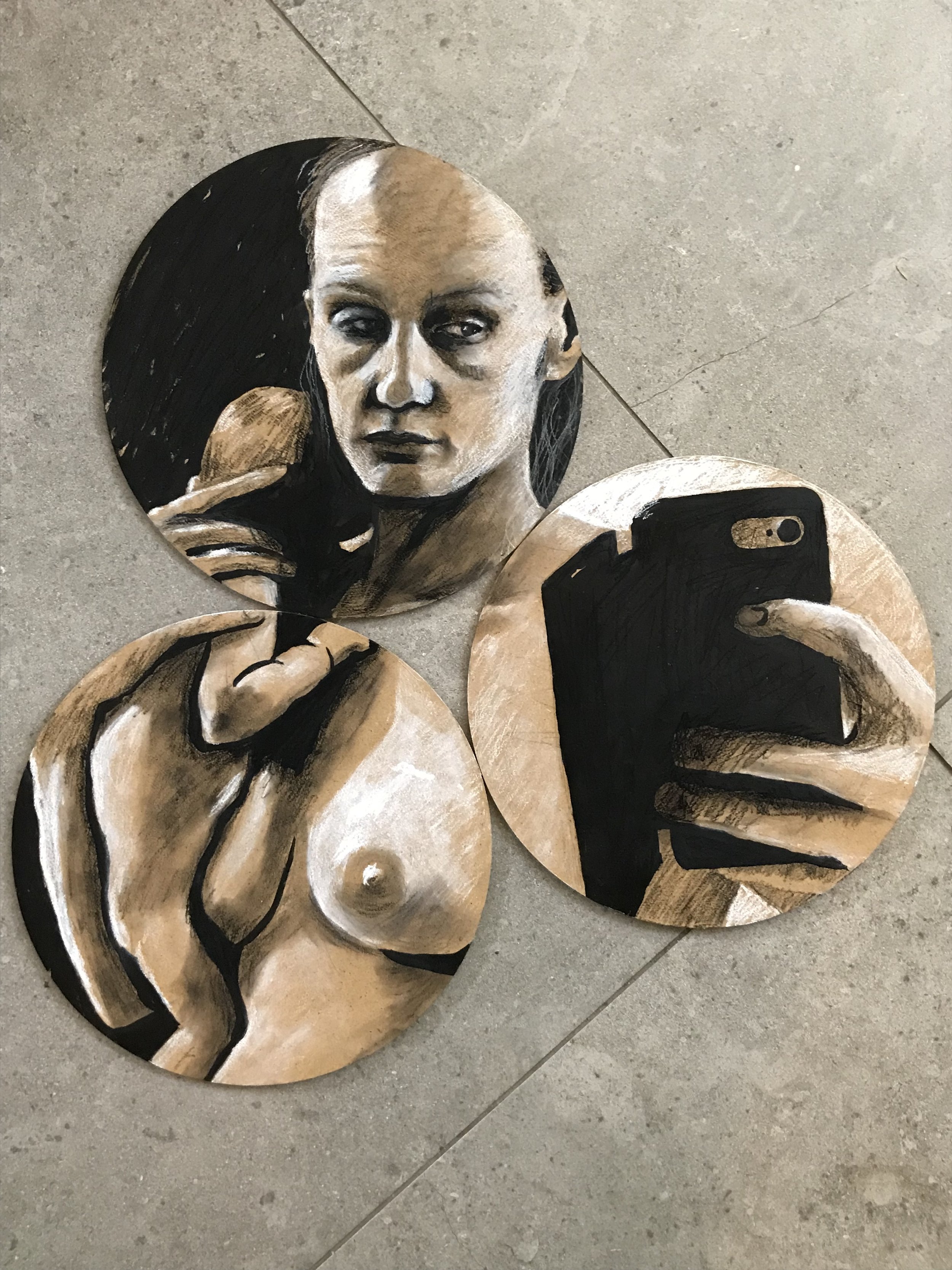

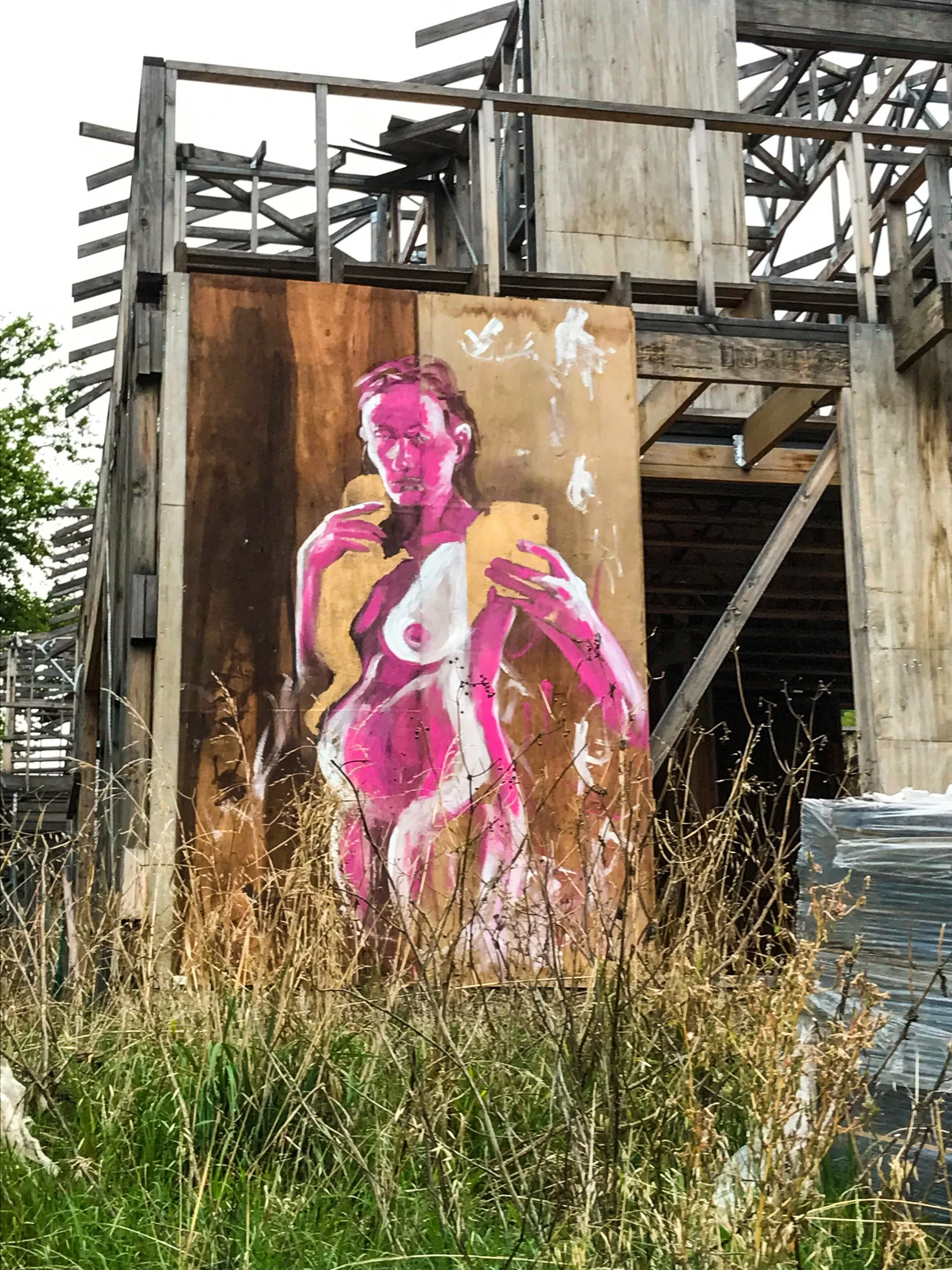


Methodologies: retaining sketch-like quality with loose mark-making; working thinly letting background shown through as midtone; allowing my daughter to participate in the making; circular motifs; monotone/confined colour palette. I rediscovered the pink/magenta paint that I used in the large board painting and I am still in love with it. I’d love to use it in this project although there is no riso colour that matches it.
Current work: I have begun work on the banners with A2 paper sewn together. I made an error with the sewing and in considering how to rectify it I realised that I needed to make these banners two layered. So funny how ‘mistakes’ happen to take you down the mental path you needed! Although I’d been considering how to layer these banners and I’d already been thinking of the layered image for the riso catalogue and photo essay, I had no clear image of how this layering would work. Below are a few images I’ve found (see my Pinterest for links to sources) similar to where I want to take it:


Mulitple images/portraits (I’ve used this device in past paintings) layered over one another, colour blocks with monotone image.