
Project 2 Presentation
Rages out-of-doors:
Below are some of the iterations I went through when translating the design to work for the collaborative Wormhole exhibition piece. The requirement for this was that the design must enter and exit the page on two sides and be 20cm wide at those points.


This final image will print quite differently on the risograph. Colours to be purple, fluro orange, and red - creating a near-black where the layers overprint.
EDITED TO ADD:
When working into the Riso space after Week 8 tutorial I did change up the design of this once more. The preview of the file is below, although since I am using fluro orange ink, along with red and blue, I’m expecting the colours to have far more punch and variation than is able to be shown on screen. I believe this composition has more impact with the colour of the paint behind the simplified single scribble mark. As red represents warning, as does fluro orange, I think this is a far better representation of ‘rages’. The black scribble being placed at the meeting between these two puddles of paint signifies angry conflict.
Sélélé (absolute silence):
Below are some of the iterations I went through when translating the design to work to the digital space. It’s been quite a while since I worked in Adobe Illustrator and it was a source of frustration trying to remember how to do what I wanted to!


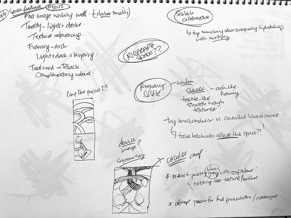
Workings in my journal during class last week and planning the final image below.

The symmetry of this circular design lends more harmony to the composition, as does the monotone teal. In looking to take it to an A3 printed space I created the below composition as a play on the planetary outer-space symbology that I was initially inspired by for ‘absolute silence’. The addition of the aged paper behind, and the written word sélélé give it a feel of a page from a book of spells or mystical truths.
